Email newsletters are a powerful tool for effective digital marketing strategy, giving you direct access to your contacts’ inboxes. They allow you to create highly personalized content and are incredibly cost-effective.
But how to create a newsletter that not only drives conversions but also conveys your brand’s image, builds credibility, and cultivates a sense of community around your product or service?
Now you might be thinking that you’re not an artist, and how will you design a newsletter.
That is where we step in with 7 newsletter design tips to make your email newsletter campaigns feel like a walk in the park.
What Is Email Newsletter Design?
An email newsletter design is something that includes all the design elements like subject line, header, layout, branding, fonts, colors, etc, you need to create a perfect a newsletter.
7 Important Components to Include in Your Newsletter Design
Different elements make up a newsletter that create a unique visual experience when blended together.
Below you will find what each element of your newsletter design entails.
1. Subject line and preheader text
The first and foremost component of any newsletter design is the subject line and the preheader text. This is also the first thing your subscribers see before opening your email.
Therefore, combining a compelling subject line with a strong preheader text can really make or break your newsletter campaign in terms of email open rates.
In fact, 47% of email users open an email based on the subject line alone.
2. Header
It’s the first thing your subscribers see when they open your email. It comes before the email copy in the newsletter design. Conventionally, it includes 3 elements: your company logo, brand name, and menu bar.

Ensure your newsletter headers are good enough to make your campaigns memorable and easily identifiable.
3. Background
As the name suggests, it is what lies behind the main content of your email. It could be anything from plain color to a custom background image - just needs to be in sync with the rest of your email.
Don’t forget to play around with different colors and create a unique color balance in your email newsletter campaigns instead of just using a blank/white background because the primary purpose of your background is to make your newsletter more eye-friendly.
4. Email copy
Email copy is a significant component of any email newsletter. It includes all the written parts.
It is written from a specific purpose’s point of view. For instance, in a promotional newsletter, you should express your message clearly and persuasively while crafting an email copy to let the readers know about an upcoming sale.
Pro tip
The email copy should be short and to the point, because readers mostly have a short attention span.
5. Visuals
Plain text emails are a big no-no for email newsletters. Therefore, visuals are an essential part of a successful newsletter campaign. They serve as a vehicle to convey your message more engagingly as readers tend to process images faster than text.
6. Call-To-Action (CTA) buttons
What’s the point of a newsletter if there’s no conversion point, i.e., a Call-To-Action (CTA) button. CTAs come in all shapes and sizes and are used to redirect your audience to your website or landing page.
A CTA can lead to various actions depending on the content’s goal. It should be prominent so readers can find it right away.
Finally, CTAs should be strategically placed in the newsletter because using too many can have a negative impact and can disorient readers.
7. Footer
The footer is placed at the bottom of the newsletter and includes a bunch of useful elements, for instance, it can include social media buttons. This will allow your subscribers to interact with your brand on social media platforms.
Moreover, you should include an unsubscribe button in the footer. Giving your readers a choice to opt out of receiving your emails is crucial. This way, you can have a much cleaner and more engaged email list.
It can also include information about why subscribers are receiving your email newsletters.
Now you’ve gone through all the major components of an email newsletter; it’s time to dive into email newsletter design tips and some examples to give you an idea of what they should look like.
7 Best Newsletter Design Tips and Examples to Keep Subscribers Clicking
It’s crucial to ensure that your newsletter design is visually appealing. We've created a list of 7 newsletter design tips to get you started. Have a look:
1. Create a hierarchy of CTAs
Create a hierarchy of CTAs in a way to direct your subscribers to the most valuable content.
Mostly, promotional emails contain a single CTA to increase engagement and conversions, but newsletters are a different story altogether.
Newsletters primarily share valuable content instead of encouraging a purchase decision. Therefore, layering your newsletter CTAs is essential to boost engagement with your content.
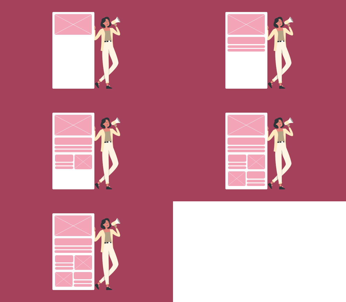
The best example of newsletters is that of digital newspapers, where you get the main story on the front page and smaller news stories distributed throughout the rest.
Similarly, your newsletters should feature 1 article or piece of content above the fold. This main content piece will depict the overall theme of your newsletter, which can be further supplemented below the fold with additional content, downloadable resources, external links, and whatnot.
This will result in a well-focused newsletter with the main CTA followed by a hierarchy of smaller CTAs encouraging readers to dig deeper.
Have a look at the below newsletter example from Fort Myers:

2. Use a template
Creating a well-designed newsletter can be time-consuming. But using a template can help save time and ensure that your newsletters have a consistent look and feel. They help you start with a solid newsletter layout and essential design elements.
With Unlayer’s newsletter templates at your disposal, you can create effective newsletters within no time. You can easily customize the content and make them consistent with your brand identity.
[

](https://unlayer.com/email-templates/newsletter)
There are 2 things to keep in mind while building your newsletter from a template:
First, ensure that the format of the template you’re using aligns with your newsletter’s goal. And the best way to do that is to define the purpose of your newsletter. For example, do you want people to read about your charity projects? Or do you wish to launch your new product? In this case, using a promotional email template won’t be a good fit for your content-heavy newsletter.
Second, don’t forget to customize your original template. Don’t change the basic structure of the template, but everything else is a free game. For instance, changing the color palette and throwing in any other design ideas is how you can make the most of email templates.
3. Maintain brand consistency
To build trust and credibility in the eyes of your subscribers, developing consistent and on-brand content is essential. It helps you build a dedicated following.
And the easiest way to do that is to stick to a template. For instance, you can use the same header and footer across newsletters. This way, you’ll only need to update the content without having to worry about the design every time.
Another newsletter design tip is to maintain consistency in your headings across newsletters. This doesn’t necessitate using the exact same headings, but keeping somewhat similar headings will let your subscribers make the most of your content, and they’ll instantly recognize your brand.
See the below newsletter example from Workona, making use of small graphics and drawings to maintain brand consistency.

4. Employ high-quality images
Using high-quality images makes newsletters more engaging. They enhance your newsletter design by making it aesthetically pleasing and breaking up the text to make it easier to read.
This gives users a chance to rest their eyes, especially for those reading your newsletter on small screens like mobile phones.
There are various ways to use images in your newsletters, but here are a few words of caution.
Use your own images instead of stock images to create better brand awareness.
Consider incorporating informational images like charts and infographics to convey the information visually.
You can also explore stamps for procreate to add appealing infographics or realistic visuals to your emails.
Use images where they add value to your newsletter because too many images can result in visual clutter. And there are high chances of your newsletters ending up in the spam folder.
Look at the below newsletter example from Made Thought, perfectly balancing images with the content to convey their message.

5. Pick fonts and colors that are easily readable
What’s the point of a newsletter if your readers cannot read its content? If you have brand colors that are hard to read, you may need to go back to the drawing board and use color schemes that work together.
This will improve the readability of your newsletters and enhance the overall reader experience.
Similarly, brand fonts should also be kept in mind for the best reading experience. Although some fonts render well on the web, in the logo, or tagline, they may not be a good fit for writing the entire newsletter.
So, use clear and legible fonts to ensure your newsletters are easy to read across different devices and lighting conditions.
Have a look at the below example from Fiverr.

6. Ensure your content is accessible
Make sure your newsletter is accessible across all devices and for differently-abled people.
When an email newsletter or website can be properly viewed on several devices, i.e., desktop, mobile, tablet,- it’s called responsive design. Since more people view their emails on mobile phones, creating responsive newsletters becomes necessary.
Thankfully, creating responsive newsletter designs is super easy with several email marketing solutions out there. For instance, all the newsletter templates from Unlayer are fully responsive and require no extra steps to be viewed on different devices.
Remember to add descriptive alt-text to your images to make your newsletter accessible to differently-abled people.
7. Promote engagement
Another newsletter design tip is to optimize it for more brand engagement and strengthen your customer relationships.
Readers can only engage with your content if given a chance to do so. Minor tweaks in newsletter design can result in higher engagement like asking your subscribers to follow your brand across channels, sharing your content with other people, and obviously, conversions.
But how to do this? Simple! Strategically placing CTAs in your newsletters is a great place to start. Be transparent and clever about where you want to redirect your subscribers.
For instance, if your company newsletter is launching a new product, it makes sense to include a ‘Learn More’ CTA linking to your new product page.
Another way to increase engagement is by including social media buttons in the header or footer of your newsletter.
In short, this nudges your subscribers to connect with your brand across different channels.
Here’s how Pixlee gives its audience an opportunity to interact with them on different platforms by adding social media buttons in the footer.

Final Words
Newsletter designs don’t have to be overly complicated. Whether designing a new marketing campaign, a college newsletter, or anything in between, these easy-peasy newsletter design tips can help boost engagement, increase open and click-through rates, and bring in new subscribers.
Happy emailing!


