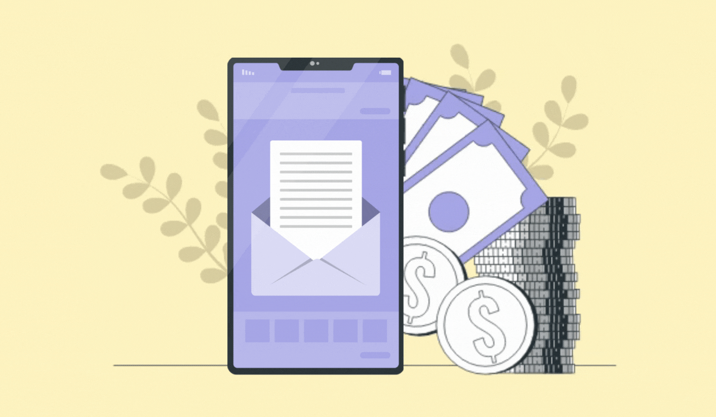
What’s the most effective form of email marketing? Figure that out, and you’ll be set for life.
The answer's right here: newsletters.
81% of marketers admit that their most used form of marketing is email newsletters. Why newsletters? Because they’re effective at producing results.
If it’s that simple, why isn’t everyone doing it? Because just any old newsletter won’t do - it has to be the greatest, most well-designed newsletter of all time to be worthy of traction.
To help you figure out how to create such a newsletter, we’ve listed eight newsletter design best practices. But before we dive into those, first, let’s take a look at what email newsletter design is.
What Is Email Newsletter Design?
Email newsletter design includes all the components, visual and textual, that make up a newsletter.
Everything from the email header, graphics, videos, and copy, all of these fall under this design category. And all these elements are closely related to one another, helping weave a more cohesive story for your readers.
5 Must-Have Newsletter Design Elements

Before we get to the newsletter design best practices, we need to know what constitutes a newsletter, i.e., the various design elements. Understanding these basic elements will significantly help you figure out how to create impactful newsletters. Here are the five crucial elements every newsletter should include.
1. Header
Naturally, whatever’s at the very start of your email, your reader will see first which matters the most. In emails, that super important space on top is called the header.
When designing a header, keep it simple and to the point. Avoid overcrowding it with too many visuals or text. Here’s Sephora’s super clean and simple email header example that includes the logo and a menu and easily blends into the main body.

2. Email copy
Remember, your email newsletter is only as effective as the content you put into it. No matter how finely designed or well-crafted your newsletter is, if the email copy doesn’t capture your audience’s attention, they will not bother reading it.
After the header, there comes the main heading of your email that sets the tone for what is to follow. And then comes the actual body content, which is the educational content you want your readers to pay attention to.
3. Graphics
Email design can be challenging - you want to keep your messages concise while providing enough information to interest your reader. You can maintain this balance by including visuals in your email layout.
Dedicated sections for images or infographics can help break up the text and add interest without overloading your readers with information.
4. Call to action button
Why are you sending out a newsletter? To get your readers to act on its message.
The best way to do that is by including a Call To Action (CTA). Including a CTA in your email is a sure-fire way of increasing clicks and conversions, so make sure you don’t take it lightly. A CTA can either be a button or a link that directs subscribers to your website or any relevant page.
5. Footer
At the very end of your email, there is the footer - the place where all the boring stuff goes typically, like terms and conditions, legal disclaimers, and unsubscribe buttons. Everything is put in there, but it’s all just small print and dull text.
However, it doesn’t have to be dull and uninviting. With a little bit of thought, the footer can be designed in a way that is both informative and visually appealing. Look at this example by Superdry that has all the information, plus some social proof to convince your readers, all the while looking good too:

8 Newsletter Design Best Practices to Keep In Mind
We’ve gone over all the must-have newsletter elements. Next, it's time to talk about the newsletter design best practices and look at how you can take your newsletters from good to great.
1. Go for minimalism
Move over maximalism, minimalism is always going to stay.
Cluttered, loud, and busy emails aren’t just a nightmare to make sense of, they’re also more likely to land you in spam. For example, if your email design includes way too many images, off to spam you go.
So, to improve your newsletter’s engagement and make sure your emails actually get the attention they deserve, try sticking to a simple design. Keeping it simple doesn’t necessarily mean keeping it short. No matter how long your email is, it can still be appealing if it’s structured neatly and is visually simple.
Creating uncomplicated newsletters improves the reading experience and helps increase your subscriber retention rates over time as well.
2. Remember the ideal newsletter width
Next, we look at the newsletter design size. Keep your newsletter width at 600 px, simple as that if you're looking for a tried and tested approach to designing newsletters.
Over the years, through trial and error, email marketers all around the globe have established that the standard width for a newsletter should be 600 px. The main reason behind this is that previously, screen resolutions only supported 600 px. While this reason is no longer valid, with screens now supporting greater widths, there is no harm in trying out greater widths.
With that being said, if you decide on a width greater than 600 px, always test it out across all email clients and viewing devices.
3. Keep it brand centric
Let’s assume your readers have opened your newsletter and gone through it. Congratulations! But a week from now, will they remember which email was yours? If the answer is a confident yes, then you can skip this section. But if you’re unsure, then stick around.
To build that brand recall in your readers, you need your newsletter to stand out from all the others. And one sure-fire way of making that happen is by distinguishing yours with your unique branding.
Now we don’t mean plaster your logo all over the newsletter. But we do mean add the logo in your email header, maybe somewhere in your footer even. Use colors across the newsletter that are consistent with your brand colors.
Even the tone you use and the font style you choose need to be consistent because it’s all part of your branding.
We can see a great example of consistent branding with Canva’s weekly newsletter:

This newsletter includes Canva’s logo on the top and doesn’t introduce any distracting colors, instead only using the staple purple associated with the brand. The tone throughout the email is also consistent with the brand’s style everywhere else.
4. Add engaging and interactive visuals
Humans are visual learners. To be more accurate, 65% of the population are visual learners, meaning a huge chunk of your readers. So adding graphics in emails makes total sense because it’s easier for the mind to scan an image than it is to scan lines of text.
However, there’s a catch (isn’t there always?)
These can’t be some lame, boring visuals. Those are just going to do more harm than good to your newsletter. Here are some different types of graphics you can add to your emails:
GIFs
Icons
Illustrations
Infographics
Memes
Photographs
Videos and other interactive elements
Lastly, don’t just add visuals where they don’t make sense, only use them if they add value to your newsletter or help make a point.
5. Make the email copy scannable
Alas, a great design and impressive visuals aren’t enough to get you through the finish line. To absolutely ensure that you’ve designed a successful newsletter, your content needs to be skimmable. You’ll lose your audience’s attention if the content is too long or complex.
Here are some definite do’s and don’ts of writing the newsletter copy:
Do align the newsletter body with the subject line
Do keep the copy aligned with your brand’s voice
Don’t write too much; keep your copy to 200 words or less
Don’t add fluff words or any jargon-y terms
Do use numbers wherever possible, such as 10% instead of ten percent
Do proofread, always
Don’t add slang words that your audience might not know
6. Ensure accessibility
Designing newsletters that are accessible means ensuring that everyone on your email list can experience the content you’re producing.
Why is email accessibility something you should focus on? We interviewed Mark Robbins, email accessibility expert, and admin of Email Markup Consortium, to find out. According to him, “If you are not allowing people to access your emails, you’re discriminating against them. That’s not cool.”
It’s as simple as that. All content should be something everyone can enjoy and interact with. If it isn’t, you’re not doing a good enough job of being inclusive.
If you’re wondering how to make your newsletter more accessible, we’ll walk you through it.

Appropriate font sizes
A small font is sometimes hard to read, even for someone with perfect vision, let alone readers with impairments. So when picking a font size, remember that some of your recipients might not have their glasses on or could be partially blind and need a bigger font size to make sense of the text.
A general rule of thumb is to use a font size of 14 px for desktop and 16 px for mobile. Of course, this isn’t a hard and fast rule, as sometimes you might need to use an even larger font size, for example, if your font is lightweight.
Color contrast
Color contrast deals with the difference between the colors of your newsletter background and the main copy. Low contrast makes reading the email difficult for people with visual impairments.
There should be a minimum contrast ratio of 4.5:1 for all standard-sized text, and 3:1 for larger text, according to the Web Content Accessibility Guidelines (WCAG)
Apart from the email copy and background, you should also consider the color contrast within any graphics you add to the email.
Image alt texts
By adding an image and no alt text, you’re assuming that everyone in your email list can visually see the graphic. That isn’t a fair assumption to make. So for the portion of your email list who can’t enjoy the graphic, what’s the alternative?
Alt texts, that’s what.
Readers with visual impairments use screen readers to vocalize newsletter emails. And these screen readers aren’t able to explain images. But they can read the alt text associated with each image, making your subscriber’s overall experience much more inclusive, instead of just being left in the dark.
7. Test all your newsletters
You can’t skip testing your final newsletter, no matter how confident you are with it. You need to double, in fact, triple-check that your newsletter design shows up perfectly on all browsers and apps. Quality control is what’s going to save the day for you.
Don’t just test by yourself. Send the newsletter to your colleagues to get their feedback and understand how it shows up on their screens and mobiles too.
Apart from internal testing, you should also regularly conduct A/B testing to determine which newsletter element, graphic, and copy gets the best results from your audience.
8. Save time - use newsletter templates instead
Following all these newsletter design best practices can be tough, especially if you’re an email marketer and not a designer. It’s not part of your job, so why worry yourself about the designing side of things? Instead, keep things simple by using pre-designed newsletter templates instead.
With Unlayer’s user-friendly drag and drop editor, you can even customize the template as you want. This means you can pick your own color theme, embed as many visuals as you wish, add personalization elements with merge tags, and more.
Conclusion
After going over all these newsletter design best practices, we hope you understand better how to create newsletters that look good and perform even better. Newsletter design doesn’t have to be super complicated as long as you keep these tips in mind.
And always remember, change is slow. Applying these best practices won’t give you instant results the very next day. Keep testing and experimenting, and we’re sure you’ll get amazing results in no time.