Millions of people worldwide check their emails on their mobile phones every day. In fact, 40% of people aged 18 years and below always open an email on their mobile device first. This is because people use their mobiles multiple times a day, and checking emails on them is more comfortable and time-saving.
What we can conclude from this is that people like viewing emails on their mobiles, and how they engage with these emails depends on how mobile-friendly they are.
To help you create mobile-friendly email designs, we’ve described the 8 best tips that will make your campaign a success. But first, let’s get the basics straight.
What Is a Mobile-Friendly Email Design?
A mobile-friendly email design is one that displays properly on smaller screens. The overall user experience should be the same as it is on desktops and tablets.
Why Are Mobile-Friendly Email Designs Important?

As per email marketing statistics, 80% of people will delete an email if it doesn’t display well on their mobile screens. This single statistic should be enough to convince you why mobile-friendly emails are important.
Not only this, but creating mobile-friendly email designs have several essential benefits that have proven their effectiveness on email campaigns. The main plus points of mobile-friendly emails are:
Increased conversion rates.
Higher audience engagement.
Reduced subscriber churn.
Fewer emails in the spam folder.
Since now you know why mobile-friendly emails are important, let’s move on to how you can design them.
8 Top Tips for Creating Mobile-Friendly Email Designs
Let’s address the elephant in the room. The success of any email design, be it on mobiles or desktops, depends on 2 root factors; your email marketing strategy and overall marketing strategy.
The precise plan of what your company wants for its email marketing should be wise and data-based. Requirements for design may be individual for different companies considering their unique style, goals, and other crucial details that form the basis of their email design.
Additionally, you must ensure that your overall marketing strategy is holistic. In other words, your email campaigns, social media posts, and Instagram feed aesthetic must be in sync with each other and your brand personality.
With that out of the way, let’s move on to the 8 actionable tips that’ll make your emails optimized for mobiles.
1. Think of a short, catchy subject line
The subject line is the first thing that your email receiver sees, so it’s important to impress your target audience straight away. However, if it’s long, it will get clipped, and then your subscribers won’t be able to read it. A powerful subject line for mobile screens is one that is catchy and features limited characters.
To make subject lines catchy, add a bit of mystery to keep your audience guessing but at the same time avoid using complex words for better comprehension. For the length, keep the characters to a maximum of 35 to avoid clipping.
For example, if you have an online podcast, the subject line, “Your next listen: Michelle Obama 🎙,” would drastically boost open rates.
2. Keep the design digestible
To make your email design more mobile-friendly, remember to keep it as simple and precise as possible. A straightforward design is more comfortable for mobile users, and it also looks beautiful and tidy.

To make your design easy for your subscribers to understand and digest, remember to follow the below tips:
Use a single-column layout. Any other layout styles will cause the elements to stack upon each other and make the email extremely long.
Use fewer words in your email copy without comprising upon your message.
The email font style should be easy to read.
Don’t go overboard with colors. Choose a single main color, and the others can be accent colors that are used scarcely.
3. Use visuals wisely
When adding graphics to emails, you should be careful not to overuse them. Visual elements, like images, videos, GIFs, etc., can make the email heaver in size. This, in turn, will take more time for the email to load and can negatively affect user experience on mobiles.
What’s the solution? Use visuals wisely. Add them when they complement your message and have a strategic purpose to fulfill. Focus on their quality than their quantity to ensure the email design is up to the mark and still light in size.
Bonus tip - To keep email light and breezy while still being visually appealing, use Unlayer’s email builder. All images are hosted on an external source, so you don’t have to worry about how heavy the email will be.
4. Don’t forget about CTAs
Call To Actions (CTAs) are a crucial part of any email. You create emails to achieve a certain purpose, and without CTAs, you’ll be unable to succeed in your mission. You might already know this. However, things are a little tricky when designing emails for mobiles.
Due to the smaller screen, it can be difficult for your subscribers to click on CTAs if they’re tiny in size or are positioned at a place where they’re easy to miss.
If you want to create click-worthy CTAs that work well on mobiles, follow the below tips;
Keep the size at least 44px to 44px.
Place the CTA at a prominent place and ensure it’s surrounded by negative space, so it stands out.
Add more than 1 CTA to provide multiple opportunities to convert.
Perform competitor analysis to see what techniques other companies use to convert their audience.
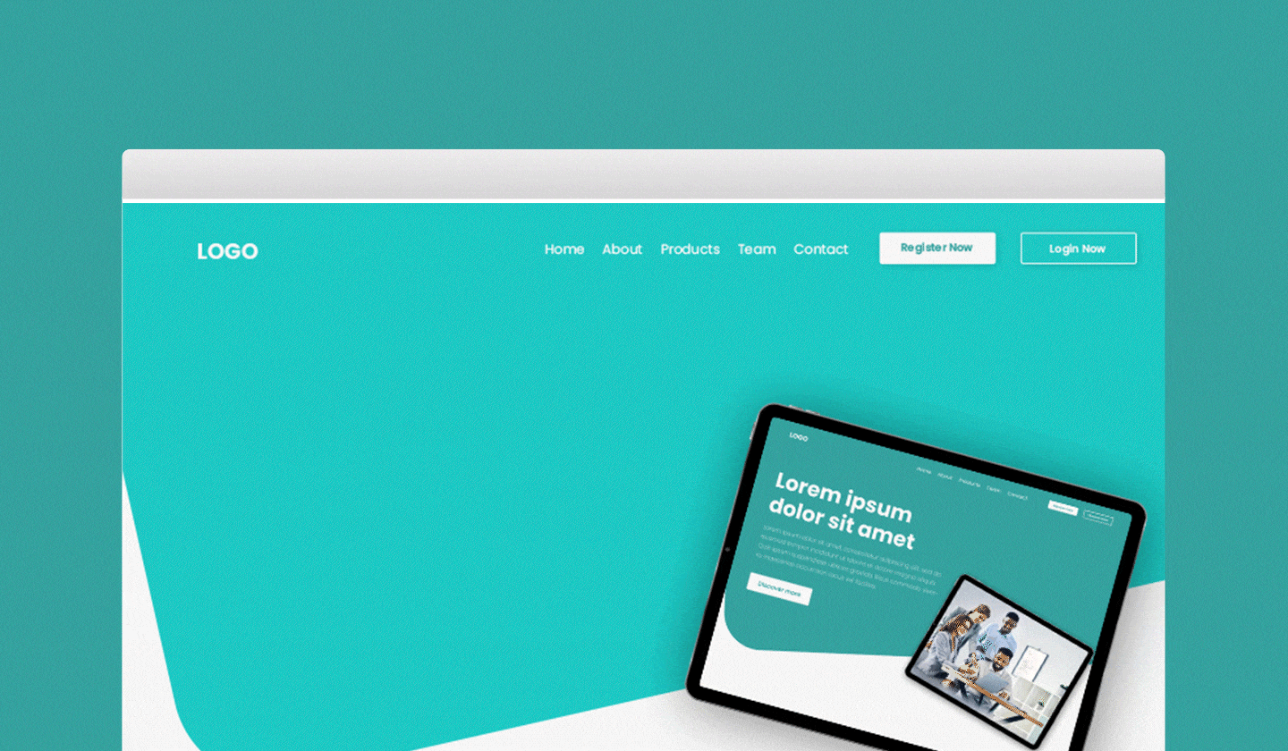
5. Use responsive email templates
[

](http://unlayer.com/templates)
Creating mobile-friendly emails is no easy task. You need to account for different smartphone models and email clients. You also need to hire developers and designers for this purpose, and we all know how employee onboarding and training are costly and time-consuming.
Time management is crucial in this process to ensure efficiency and avoid unnecessary delays in email creation.
A better way to create mobile-friendly email designs is using responsive email templates. They are already optimized for mobile screens, so there’s a lesser risk they won’t render well.
Unlayer offers a gallery of 1,000+ responsive email templates that can be customized with drag and drop. The best part about this editor is that you can preview emails on mobile screens beforehand so you can tweak the designs if needed.
6. Leave some space in your emails
Writing catchy texts and adding attractive visuals is a good practice, but it would be wise to let your email breathe and leave some blank areas between texts and images for a better effect.
Leaving some negative space in your emails will help them look cleaner on mobiles and let your recipients read them without getting distracted.
White space also works for separating texts and CTA buttons, emphasizing their importance, and having the reader's attention on the right things. However, don’t leave so much space between texts that the reader misses out on the essential information within the email.
7. Limit vertical scroll
Have you ever read a social media post on your mobile that just won’t end? You scroll and scroll, and in the end, you just give up.
You need to be careful about vertical scroll when designing emails, or else your subscribers will go back before clicking on your CTA button. With emails displaying on mobiles, different elements stack upon each other since there isn’t much horizontal space as with desktop or tablet screens.
You can avoid lengthy emails by following a single column layout, adding no more than 3 images, communicating a single message, and sizing visuals appropriately.
8. Do A/B testing
To ensure whether your mobile-friendly emails are working or not, it’s always recommended to perform A/B testing. The latter is the process of testing 2 different variants of an email and comparing the results to see which performs better.
For example, you can measure the placement of your email’s CTA. Create 2 versions of the same email; one with the CTA below the header and the other with the CTA above the footer. Stick with the email and the CTA that brings in higher conversions.
Through this, you can test your strategies to determine if your audience welcomes them or not.
Conclusion
In recent years, the business world has been actively using email marketing to generate more sales and engage new customers. As email marketing is directly connected to customers, the purpose is to create appealing and mobile-friendly email designs that should convert them.
The 8 tips mentioned below will help you succeed in your email campaigns and receive only positive feedback from your customers.