Last week was my friend's birthday. I'm not sure what the deal was with her friend Anna, but she kept on asking inquisitive questions THE WHOLE TIME!
So my other friend Josh says, "Anna, you're kind of like a living lead generation form, constantly asking us about our details."
What's funny (and weird) is that the thought kept me up. This girl, Anna, would’ve made a terrible lead generation form because she asked a little too personal questions in an unpleasant way. And since a marketer's mind never switches off, I spent the night thinking about what could’ve worked for her and what didn't - as a living lead generation form. 🤣
Fast-forward and I'm here, writing about the dos, don'ts, and best practices of creating unavoidable lead generation landing pages, all triggered by that little event. I'm passing down my years of research and practice to readers who might need it.
And yes, I've even included some of the best lead-generation landing page examples I've found too to inspire you.
So, let's get started by talking about what a lead generation page is and why it matters.
What Is a Lead Generation Landing Page?
The name itself is quite self-explanatory. A lead generation landing page is designed for a single purpose - to generate leads.
If you’re wondering whether your business needs a dedicated landing page to generate leads, you should know that 50% of marketers say that lead generation is their top priority, and 55% of B2B companies believe that attracting quality leads with content is a top challenge for content marketers.
Lead generation landing pages are crucial to attracting leads for your business. But the catch is that creating landing pages that attract maximum eyeballs and make visitors engage is trickier than it seems.
But as I said earlier, I’ve done the hard task of gathering industries’ best examples and assembling all the tips and best practices here for you so you can design banger lead generation landing pages effortlessly.
After all, that’s what good content marketers are here for.
So, let’s begin by discussing some surefire tips to design high-converting lead-generation landing pages.
Best Practices to Create Lead Generation Landing Pages
In the story I told you guys earlier, I never mentioned the number of times people darted their eyes away from Anna because she failed to win their attention and interest.
To prevent your landing page from getting the same treatment, we’ve listed some tips and best practices to help you create and publish lead-generation landing pages that encourage maximum interaction.
⭐ Offer unique value
Remember, you’re asking your valued customers for their personal information, so it's ideal to offer them something valuable in return.
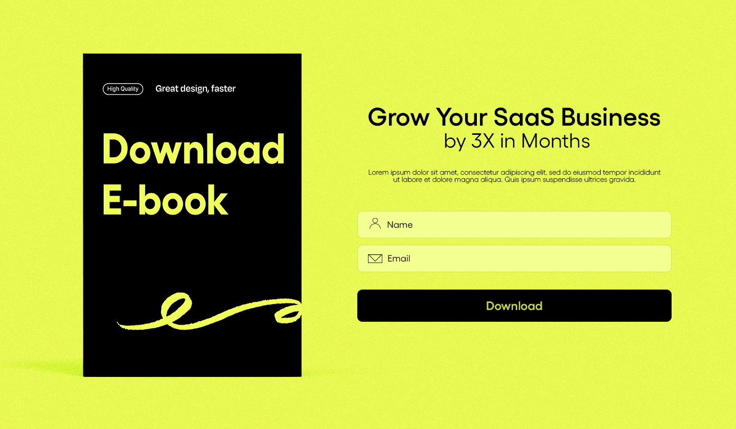
When I say valuable, I mean something that provides unique value, like an e-book with lessons that aren’t easily available online or a promotional discount on your customer’s desired tier plan. Basically, anything that makes it worthwhile for them to trade their information against.
⭐ Leverage progressive profiling
Want to know everything about your customers without sounding too nosy?
Use progressive profiling.
Progressive profiling is a marketing technique in which marketers gradually gather customers' personal information, one at a time.
For example, if you asked for their name, email address, and contact number in the first form, add two to three more fields in the next form to ask about their company’s name or industry.
Here’s an example to help you do it.

This way, the customers are comfortable sharing their details, and the business does not sound too intrusive.
⭐ Create relevance
Personalizing your message is another way to increase the chances of your customers responding to your landing page.
Mention their preferences according to their needs and behavior. This will make them relate more to your product and boost response rates tremendously.
Even experts lay quite an emphasis on making your lead generation content as relevant as possible.

⭐ Add a prominent CTA
Your landing page must also include a vibrant and well-placed CTA button.
Ensure the CTA does not confuse the reader and clearly describes the required action. And if you want to increase the chances of conversion, you must personalize your CTA. Because personalized CTAs convert 202% more than non-personalized CTAs.
⭐ Make designs scannable
This tactic is so fruitful yet so overlooked that it pains me.
Make your designs scannable and incorporate Z-pattern or F-pattern. This way, your reader will be directed to the CTA button and consume the content of your landing page more effectively.
⭐ Write a compelling copy
They say, “Words are potent weapons for all causes.” and I couldn’t agree more.
Try to write a landing page copy that makes the reader want to continue reading and converting. You must
✍🏻write a persuasive copy,
✍🏻use simple and comprehensive words,
✍🏻personalize it according to the target audience,
✍🏻state clearly what you have to offer (no beating around the bush)
⭐ Create mobile-friendly designs
Did you know that 53.3% of website traffic comes from mobile devices?
Yes, more than half.
So, to ensure that a maximum number of users access your landing page, you must create responsive and mobile-optimized landing page designs.
⭐ Add testimonials
Remember the last time you bought clothes, make-up, or anything based on someone’s recommendation?
Yes, we all do. Including your sweet customers.
So, try to add testimonials or reviews on your lead generation landing page to drive more leads. Because your customers are most likely to invest their time and energy in something with a positive reputation.
Here’s a wonderful example from Trustmary.

⭐ Add conversion driven forms
It’s one thing to design a form, but to design a form that makes your readers go, “Yeah, we don’t mind giving you our information, is an art.”
And here’s how you master it.
👉🏽 optimise them for mobile devices
👉🏽 display benefits next to your form
👉🏽 add fields that your readers are most likely to interact with
👉🏽 test the form length results in most conversions
Practices to Avoid
This is everything you should do to create a landing page that drives maximum leads, but what about the things you should avoid? Yeah, let’s talk about that now.
🔴 Asking too much information
As a business, it’s natural to wish you knew all the details about your customers. But there’s a fine line between asking and asking too much.
Avoid asking for a lot of personal information to ensure your customers feel comfortable and secure sharing their information.
Or else they’ll freak out for real.
🔴 Adding heavy or low-quality images
If words are weapons, images are nuclear bombs when it comes to making an impact. 💣
A good-quality image can strengthen your case; conversely, a bad one can put off users. So, ensure the images you add are relevant to your message and of high quality.
Also, adding heavy images or animations on your lead generation landing page can reduce the loading speed of the landing page. However, an image optimization checker can help you optimize images for better results.
🔴 Not testing before making it live
Do I even need to mention the stakes of not testing your lead-generation landing pages?
Exactly.
Please test the performance of your landing pages based on
the design elements,
different environments,
varying copies
🔴 Multiple messaging
If you add more than one message to your lead generation page, you will confuse your readers. As a result, they’ll get distracted and leave without responding to even a single message.
Research suggests that adding multiple offers to a landing page can decrease conversions by up to 266%.
And this is what you must be mindful of while designing landing pages. Now that we’ve completed the actionable steps, let me show you how some businesses created a lead-generation landing page.
7 Lead Generation Landing Page Examples to Inspire You
Some companies really invest a lot of time and effort into creating lead-generation landing pages. So why not learn and gather inspiration from the OGs themself?
Let’s start one by one.
Semrush

Trust Semrush to nail each and every one of their tasks.
I LOVE this design, which is 100% brand-centric. It screams Semrush even at first glance.
Plus, love the fact that they neatly separated the form and the copy in this design to make the design more breathable and consumable. Also, notice how they synced the orange CTA button with words in the heading. Kudos to the design team! 🥳
Optimizely

The next one is from Optimizely. I have a weakness for black backgrounds, so I can be slightly biased with this one.
Optimizely offered a case study about split testing on its lead generation form. To encourage users to download it, it includes a short four to five line introduction to split testing and the case study.
A simple and informative copy can be a game changer for your landing pages, no matter what the purpose.
PandaDoc

This lead generation page from PandaDoc is another favorite.
PandaDoc added their G2 awards and reviews as social proof. It's uncommon and quite smart to place social proof against a lead generation form. After all, who wouldn’t want to know more about highly recommended software that has bagged honorable rewards?
Also, we love how the design of this page aligns with PandaDoc’s brand identity.
Integrify

This is another impressive lead-generation page. And no, I did not pick it up solely because of its black background.
Integrify synchronized this page’s heading and CTA button. It also has a straightforward value proposition that doesn’t confuse readers. Not to mention how they clearly listed the benefits of signing up, such as access to additional information.
Sprout Social

We talked about personalization earlier and found the perfect example to demonstrate it.
As evident from the copy, this lead generation page is tailor-made for employees. Leaving no ambiguity as to who should opt for this solution.
Another reason the copy deserves appreciation is that it highlights the problem of ‘buyers engaging more with employees’ and presents itself as a unique solution to this problem.
Overall, this landing page's design is also clean, uncluttered, and minimalist, which blends perfectly with Sprout Social’s brand identity. Although they could have done a better job with images, I’d let this slide because of the well-written copy.
Simple yet strong. This is how you should create your designs.
Slack

Slack did a remarkable job at copywriting, with a clear and concise heading followed by the benefits of using their software. The form stands out against the beige background, encouraging users to fill it out quickly. I also really like the purple and well-described CTA buttons.
Design-wise, it's a good attempt, but they could also improve their visuals or color scheme to make the whole landing page more visually appealing.
Portnox

Love me some humor.
Portnox does a great job at marketing its service in a fun way.
This lead generation page does not have an e-book, offer, or case study to incentivize it, with the aim to collect leads who are genuinely interested in the product. Also, I really like the interactive and detailed form.
Long and detailed forms will most likely generate high-quality leads and help businesses segment and understand their customers better.
Top 3 Recommended Tools to Design Lead Generation Landing Pages
We discussed how you could create highly interactive lead-generation forms and saw some really cool examples. Now it’s time to talk about the real deal - tools that can help you create lead generation forms quickly and easily.
To avoid any confusion and keep things simple, I’ve mentioned the top three landing page builders for you to choose from.
Unlayer

Unlayer is a no-code drag-and-drop builder that enables users to design beautiful and responsive landing pages, documents, emails, and pop-ups.
Unlayer is a feature-packed tool that gives users complete control over their designs. To help you decide better we’ve listed the abundant features of Unlayer below:
User-friendly editor
Custom tools
Custom blocks & re-usable elements
Mobile responsive content
Code samples and demos
Merge tags for personalization
AI features to help with copy (smart headings, smart buttons, magic images, and text generator)
Team collaboration to streamline the workflow process
Custom cloud storage or self-hosted storage
Language support
Roles and access management
Ability to design using own code
Dark mode
A 17-hour window for customer support
All these amazing features, too, with the most reasonable pricing. If you haven’t yet explored Unlayer, this is your cue to start now.
Unbounce

If you’re a SaaS marketer, Unbounce needs no introduction.
Its reputation is well-established because of its vast landing page template library and optimization features. The one thing that makes users reluctant or skeptical about opting for Unbounce is that its advanced features fall under pricier plans, which aren’t exactly budget-friendly for everyone.
Nonetheless, Unbounce offers enough features to create high-performing landing pages, such as
A/B testing tools
AI assistance for copywriting
1,000+ integrations
Customer support through phone, email, and live chat
Ready-made templates to choose from
You can choose their pricing plans according to your business’s budgets and requirements.
Instapage

Last but not least, there’s Instapage, which enables users to create, customize, and optimize landing pages according to their campaign requirements.
Instapage offers a range of beneficial features, such as:
Reusable blocks
AI-powered content
Mobile responsive content
Real-time visual collaboration
You can opt for their Optimize or Convert plan to enjoy more features.
Make sure you pick the tool that offers the most features at a reasonable price. After all, it’s about your business’ content and the quality of the tool you’re investing in should not be compromised.
Conclusion
Creating a landing page that drives high-quality leads is no walk in the park.
After all, you’re asking your customers for their personal information, so your landing page has to appear convincing and trustworthy enough to encourage their responses.
I wrote this piece hoping that the tips, examples, and tools listed above will help readers create lead-generation landing pages that convert the maximum number of leads.
Rooting for you!
Good luck.
FAQs About Lead Generation Landing Pages
Got some questions running through your mind?
Most of us do.
We answered some frequently asked questions from users. These might help us answer some of your questions or queries.
Q. How do we measure the lead generation landing page’s performance?
A. To measure the performance of your lead generation landing page, you can measure factors or KPIs like:
Bounce rate
Conversion rate
Traffic source
Average time spent on your page
Average lead cost
Lead quality (most importantly)
Q. How do you optimize your landing page for conversion?
A. To increase the chances of attracting leads through your landing page, you must
⭐ personalize your message,
⭐ offer value through resources,
⭐ create neat, attractive, and conversion-centric designs,
⭐ write a clear copy (avoid jargon terms),
⭐ track what’s working through heat maps and analytics,
⭐ create responsive and mobile-optimized designs
Q. What types of incentives can we add to the lead generation landing pages?
A. You can offer incentives based on your business. Some common examples of value-driven offers include:
promotional coupons,
E-books,
case studies,
free courses,
discounted subscription,
early bird discount, etc


