Let’s say you created a website for your one-of-a-kind product or service, and you’re confident it is something users can benefit from.
It’s time to convince people that your product or service is the real deal by creating an online presence that tells them what you offer and why they should opt for it.
The most trusted way of doing this is by creating captivating landing page designs endorsing your awesome product/solution.
Wondering how you’d do that?
Then stick around because we’re about to reveal everything about creating landing page designs that’ll turn your website visitors into loyal customers. To begin with, let's discuss why landing pages are so important to accelerate your business.
Why Are Landing Pages So Important for Your Business?

You’re probably wondering why people stress so much about creating landing page designs that convert.
Well, you’d be doing that, too, when you realize how beneficial they are. So, let’s dive in and learn the advantages of designing amazing landing pages.
Landing pages enable businesses to:
➡️ Increase your website traffic by attracting more visitors.
➡️ Create a lasting good impression.
➡️ Promote your products or services more effectively.
➡️ Grow your subscriber list by converting visitors into paying or loyal customers.
➡️ Boost the revenue of your business by directing visitors to take a desired action.
➡️ Improve your brand’s credibility.
Sounds good enough to entice you into building awesome landing pages?
We thought so, too! 😎
Now, let’s get to the meaty section of this article, i.e., tips for creating landing page designs that convert.
How to Create Landing Page Designs That Boost ROI?

Before diving into the technicalities of design, let us share a golden tip with you. 🌟
That is, when creating landing pages, your goal should not only be to create designs that catch eyeballs but also resonate with your target audience.
Primary goals for creating landing pages:
designs that catch eyeballs
resonance with your target audience
After all, visitors will only interact with your designs if they find them relatable and useful. Now that’s sorted, make sure your landing page designs include the following design elements:
1. Responsive designs
You’d be surprised to know that over 80% of internet users browse the web through mobile devices.
This means that if the lion’s share of people access the web through smartphones, you must ensure that your landing page designs are responsive and display well on all devices.
Thankfully, using Unlayer keeps you off that worry because all landing pages designed with Unlayer look great on every device.
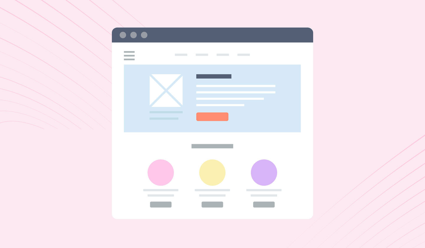
2. Captivating hero section
Your landing page’s hero section is the first thing that grabs a viewer’s attention when s/he visits your website. So it deserves your special time and attention.
To create an outstanding and well-performing hero section, make sure you convey the following messages through your design and copy:
🔶 What do you offer the visitors?
🔶 Why should they trust your brand?
🔶 How will your brand benefit the users?
🔶 What action do they need to take to leverage that benefit?
You can add attention-grabbing CTAs, headings, testimonials, and design elements to create a hero section that justifies its name. No pressure, but this is where your viewer will take the decision to stick around or leave! 🎯
3. Meaningful color palette
According to research, 85% of people say that color is a primary reason for purchasing a product. So, you must choose colors that align with your brand’s identity and product or service to win over your subscribers.
Also, color psychology has a big influence on moods. Therefore, try to choose colors that positively impact your viewer’s mood, such as yellow, green, light blue, and orange.
Another important role that colors play is highlighting the elements of your page. For example, if you use a contrasting color for your CTA, people are more likely to notice and click on it.
4. Minimalist design
Minimalist designs include sufficient negative spaces, have fewer design elements, and are easier to digest by the users.
Besides looking visually pleasing, they are great at creating visual hierarchies and communicating messages more effectively.
Minimalist designs are great at communicating messages more effectively because they have:
visual hierarchies
sufficient negative spaces,
fewer design elements, and
strong visual appeal
So, opt for minimalist designs. Even if you plan to add interactive elements, make sure you don’t overdo it.
5. Explanatory videos
Sources reveal that adding videos on landing pages increases conversions by 80%. This alone should be enough to convince you to add interactive elements like videos on your landing page.
In addition to boosting engagement, videos help your viewers understand your product/service quicker and better.
However, while including videos, remember to create an enticing thumbnail, turn off the option to autoplay, add subtitles, and include a CTA.
Only these factors will make adding videos on landing pages meaningful and beneficial.
6. Enticing copy
No matter how awesome the color palette of your landing page is or how many interactive elements you add, your headline is the first that your viewers will notice about your landing page.
So, write a catchy headline for your landing page. But don’t try too hard to be funny or peppy because the simpler, the better.
In a nutshell, keep it short, sweet, and straightforward.
7. Prominent testimonials
We can’t emphasize enough the importance of testimonials on landing pages.
Research states that 92% of people trust online reviews and testimonials when purchasing something. We’re sure you do that before purchasing anything, too.
A positive testimonial can bring meaningful value to your landing page and encourage subscribers to act favorably.
8. Consistent branding theme
Another useful design tip is choosing colors and design elements representing your brand.
For instance, if you’re designing a landing page for a luxury brand, try to use pastel or sophisticated colors rather than peppy themes.
Also, if your landing page has more than two segments, try to choose a monochromatic theme.
9. Simple layout
Layouts play a huge role in convincing users to engage with your website. Trust us when we say this.
Choose layouts with a Z or F pattern that directs or leads your visitor’s eye to the main CTA. Plus, it’s best to choose a simple layout, as multi-colored layouts appear like a visual salad of some sort.
Incorporating these tips will make your landing page designs super pretty and entice your visitors to take action in your favor.
Want to know what the experts have to say about designing landing pages? Have a look: 👀
Insightful Tips From Experts About Landing Page Designs
We firmly believe in learning from SMEs (Subject Matter Experts). After all, they’ve spent years in practice to become the MVPs of their domain.
So, we collected some valuable tips from SMEs about designing landing pages for conversion and compiled them here. Try incorporating these to boost your website’s sign-up or conversion rates.

It’s amazing how these little tricks and hacks can make a huge difference in the appearance of your landing pages. So, try these out to take your landing page design game to the next level.
Now, let’s move to some action plan.
You’d be impressed with how convenient and simple it is to design stunning landing pages with Unlayer. Let’s talk about it a little in detail:
Create the Coolest Landing Page Designs Ever With Unlayer
Unlayer enables you to design the most captivating landing page designs within a matter of minutes.
All you need to do is follow these five simple steps:
Step 1: Go to Unlayer’s website and click on start designing.
Step 2: When you enter the editor, click on new template > page builder.
Step 3: Drag and drop the features, such as videos, text, etc., to create a landing page of your choice.
Step 4: Once designed, preview it for its responsiveness.
While viewing the design on mobile or desktop, you can alter the design according to the screen size.
Step 5: Export your design through our 50+ integrated ESPs including Mailchimp, ActiveCampaign, and Campaign Monitor.
And tada! You’ve created a cool landing page, perfectly resonant for your audience and responding to your needs! So simple.

Unlayer offers the following list of features to make creation process easy for you:
🟣 A user-friendly drag-and-drop editor
🟣 Comprehensive documentation
🟣 Custom tools
🟣 Custom blocks as reusable elements
🟣 Mobile responsive content
🟣 Code samples and demos
🟣 Merge tags for email personalization
🟣 AI features
🟣 Choice to hide or display items on the mobile version
🟣 No limit on the usability of tools
🟣 Team collaboration to streamline the workflow process
🟣 Custom cloud storage or self-hosted storage
🟣 Language support
🟣 Playground to see how the product works
🟣 Roles and access management
🟣 Display conditions
Sounds too good to be true? Try it out yourself.
Now that you’ve learnt how to create the most stunning and impactful landing pages, it’s time to share the visual examples of these design guidelines. But before that, let’s quickly answer some FAQs you may find insightful:
Some FAQs About Landing Page Designs
Optimizing the design of your landing page for conversion may not be as easy as it seems.
To gather more insight, we answered some FAQs about landing page designs that you might find helpful. Have a look:
1. What’s the ideal placement for video on landing pages?
Ideally, your videos should be placed above the fold of your landing page.
This is mainly because the average attention span of humans has been reduced to 8.25 seconds. So, it’s best to add important information, such as a video, above the fold.
2. What’s the first thing visitors notice about your landing page design?
The first thing visitors notice about your landing page is your headline. So make sure it's catchy and informs them about your offering in the first go.
3. How long should a landing page be?
There’s no rule of thumb for this. But a best practice is creating landing pages that are at least 300 words long. And they should not be so long that they distract or bore your visitor before making a conversion.
These were the most frequently asked questions related to landing page designs that we came across. If any questions popped up in your mind while reading this article, feel free to ask us in the comment section below.
5 Landing Page Design Examples That’ll Make Your Jaws Drop
You might be looking for some inspiration by now, and we’ve got exactly what you need.
Below, we have listed five of our favorite landing pages that stole our hearts and attention for different reasons. Have a look:
1. Vimeo

Industry: SaaS
Why do we love it?
📹 Interactive elements such as videos that speak for their product’s quality.
🎨 An elegant yet captivating color palette.
🔳 Minimalist layout design.
Did this inspire you? Then, create your own version with Unlayer.
2. Native Poppy

Industry: Floral
Why do we love it?
🎨 Colors that easily steal any visitor's attention.
🔴 Prominent CTAs that clearly describe the action to be taken.
💙 Accurately displayed the brand theme through design.
Did this inspire you? Then, create your own version with Unlayer.
3. Dataddo

Industry: SaaS
Why do we love it?
🎨 Colors that go perfectly with their SaaS solution.
✍🏻 An enticing yet comprehensive copy.
👍🏽 Social proof with the best clients mentioned in the hero section.
Did this inspire you? Then, create your own version with Unlayer
4. Estee Lauder

Industry: Beauty & Personal Care
Why do we love it?
Did this inspire you? Then, create your own version with Unlayer.
💄 Displays products that speak volumes about their worth.
🔳 Minimalist use of design elements.
✍🏻 A simple and comprehensive copy.
5. Chanel

Industry: Fashion
Why do we love it?
💄 Displays new products for promotion.
🔳 Minimalist use of design elements.
✍🏻 A simple and comprehensive copy
Did this inspire you? Then, create your own version with Unlayer.
So, these were some of the coolest landing page designs we encountered.
Wrapping Up
All amped up to create landing page designs that’ll get those conversions rolling?
Awesome.
We hope you found these tips and tricks useful and will incorporate them in your future projects.
