An email footer rarely gets any attention because you probably spend most of your time nailing the subject line and email copy.
But here’s the real deal: you can’t knock it out of the park without an attractive, informative, and legally compliant email footer.
So, let’s dig into some of the best email footer examples and tips to work your email marketing charm.
To begin with, have a look at what the email footer is and why it matters.
What Is an Email Footer?
The email footer is the final block of communication in your emails that features essential information related to your brand identity and company details.
It can include basic information like your company’s address and job title or more valuable details such as contact info, social links, or legal disclaimers.
Why Does the Email Footer Matter?
It might seem insignificant, but an email footer can considerably increase traffic because they give recipients all the vital information about your company. Additionally, it helps build your brand online and establishes trust with your email recipients.
Here are a few reasons why you should have a well-designed email footer:
It demonstrates professionalism and is essential for long-term business success.
The company logo and website link in your email footer create brand awareness.
It’s an excellent opportunity to promote your social media platforms for better engagement.
It saves you from legal trouble since you’re complying with the guidelines provided by regulators, like CAN-SPAM.
How to Design an Email Footer With Unlayer?
Unlayer offers an easy-to-use drag and drop editor to create email footers. As per the GIF below, you can use the elements given on the right-hand side of the editor and edit the footer of the email template as you prefer. You can add images, text, and links of your choice and create highly engaging email footers.

With Unlayer, you get the opportunity to save custom blocks like email footers. So you don’t have to design them again and again for your email campaigns.
11 Email Footer Examples to Consider for Maximizing Impact
You must find the right balance to create an email footer that meets your needs. For instance, adding too much self-promotional information in your email footer is not a good idea.
But how to do that? See the below email footer examples to get inspired and create highly engaging email footers.
1. Let users unsubscribe or manage email preferences
We know it takes time, effort, and energy to grow your email list. But it is always best to respect your recipients’ freedom of choice and let them choose whether or not they want to receive your emails.
Because having subscribers barely engage with your content isn’t worth your time and energy. Plus, you don’t want your emails to be flagged as spam and risk your IP address from getting blocked. So, giving them the option to unsubscribe is best for better email engagement and conversion rate.
Similarly, you can add a link to let users manage their email preferences to increase email engagement and prevent emails from ending in the spam folder.
The below image is a great email footer example from Pineapple Collaborative, which incorporates clear and easy-to-find unsubscribe and email preference links.

2. Provide legal information
Comply with anti-spam government regulations by adding information like your company’s registered office address, privacy policy, terms and conditions, and copyrights.
The more information you give your subscribers, the more likely they’ll trust your company and continue receiving your emails.
For example, see the below email footer from Codecademy, including all the elements mentioned above to make it appear authentic.

3. Focus on your brand’s mission and values
Telling customers your brand’s mission and the value you add to the world will encourage them to take action, so why not include this information in your email footers?
Let your subscribers know what your business stands for because combining a great product with a meaningful mission can help you garner the most loyal customers.
Look at the below email footer example from United By Blue, a sustainable clothing and home goods company.

4. Ask subscribers to whitelist your email address
Asking your customers to whitelist your email address is a great way to avoid spam filters and blockers.
In simple words, doing this will ensure that your email will be received and opened since your customers have chosen to receive emails from you.
Here’s an email footer example from Postable, where they included a link to ask their recipients to add their email address to their address book.

5. Add social media icons
Adding social media links to your email footers gives you a high chance of engaging your audience on other platforms. It motivates them to take action and drives traffic to other channels.
Instagram, Facebook, Twitter, and many other platforms are widely used, so why not show your customers what your business offers there?
By clicking the social media buttons in the below example from South Dakota, you can access all their marketing posts and perhaps make a purchase.

6. Help subscribers download your app
Nearly 79% of smartphone users have made an online purchase using their cell phones. Hence, it seems logical to give your customers the option to download your mobile app from Google Play or iTunes by adding a relevant link in your email footer.
This will be a massive opportunity for you to promote your mobile app and increase your downloads.
Look at the below example from Goodreads, promoting their mobile app and encouraging their subscribers to use it.

7. Let them get in touch with your team
The audience you’re sending your emails to is likely to have questions and could use some help with your services.
Therefore, you should provide a way for them to contact you in your email footer.
You can provide a direct link to your live chat or help them reach your support team.
See the below email footer example from Shopify, ready to proactively satisfy their customers' needs.

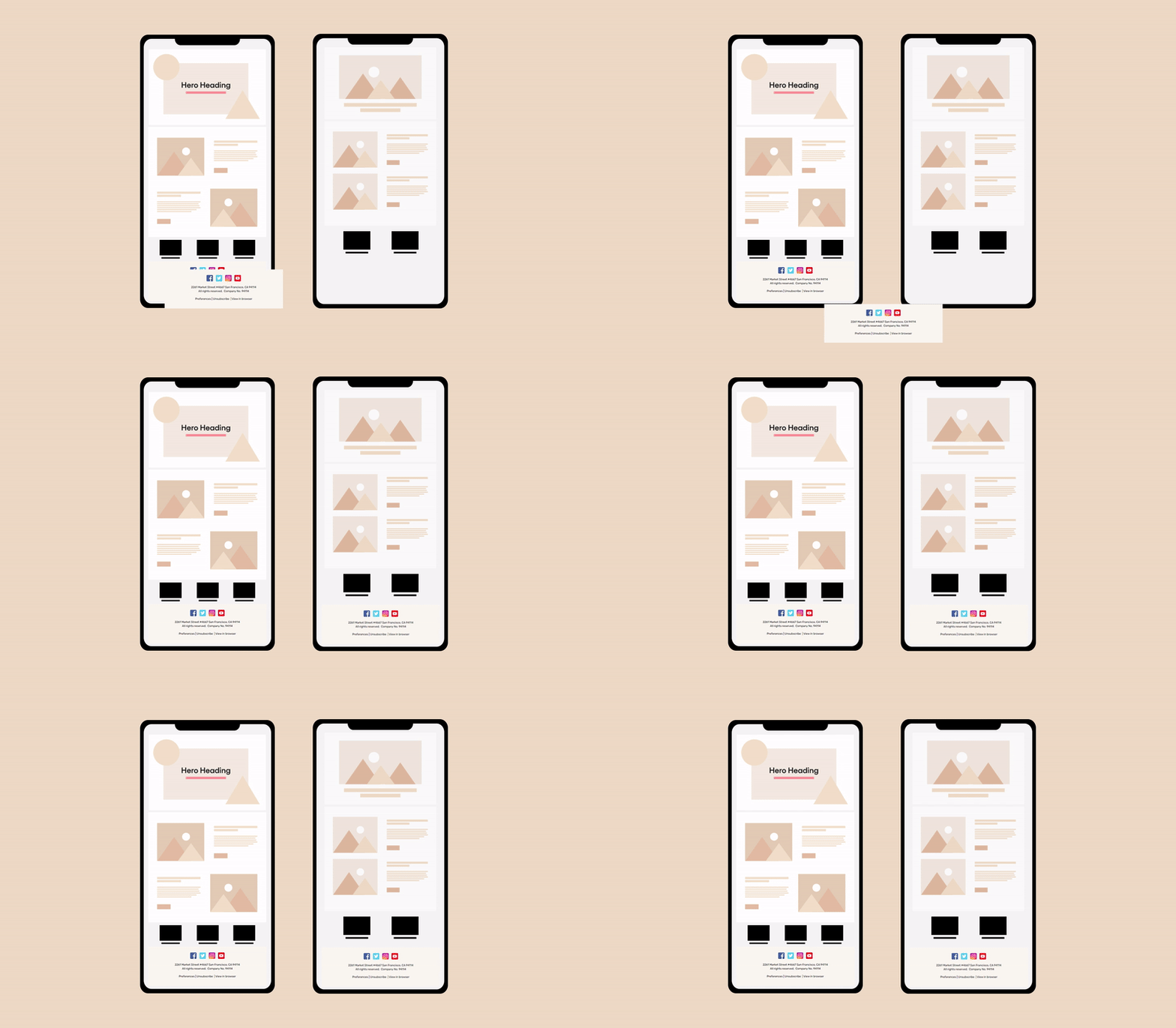
8. Make your email footer mobile-friendly
Around 61.9% of email campaigns are viewed on mobile. So, having a mobile-friendly email template with an enticing footer makes perfect sense.
Adjusting your email footer for mobile devices can significantly improve your conversion rate.
A good email template builder can easily optimize your email footers for desktops and mobile devices.
See how this email footer example from Netflix perfectly fits the phone screen.

9. Include social proof
If someone has reached the point of reading your email footer, either they are looking for an unsubscribe button or are genuinely interested in your brand and want to know more.
So, it is the ideal time to include social proof here to build trust and assist your customers in their decision-making process.
You can either mention your company’s facts or add a satisfied client’s review to prove your credibility.
This example from Babbel subtly hints at how their 10 million subscriptions have already been sold in the email footer.

10. Sync your design with the brand’s overall look
Attention to detail is essential in email design. Therefore, you should align your email footer with your brand’s overall style and identity.
Your users will be surprised to see that you’ve paid attention to the tiny details in your email footer and will remember your brand for a long time.
Look at the email footer example from Hestan Culinary that aligns well with the brand’s overall design and feel.

11. Incorporate a security disclaimer
If you’re sending sensitive information via email, you must include a security disclaimer in your email footer. This will let your recipients know that the information they share with you is confidential.
For instance, Stacks has added an important security disclaimer in the footer that informs their readers that Blockstack PBC isn’t licensed by the USA's Security and Exchange Commission (SEC).

3 Email Footer Tips for a Top-Notch Design
Here are a few additional tips for your email footer that you might find helpful.
1. Keep it simple
Your email footer is not the place to write a novel. So, keep the messaging short, sweet, and to the point. You definitely don’t want your readers to get overwhelmed and want them to be able to scan the information in your email footer quickly.
2. Use the space wisely
Since email footers are featured at the bottom of your message, use that space wisely. Only incorporate the most important information in the footer and leave out anything redundant.
For example, the most important information can be an unsubscribe link, social media buttons, a privacy policy link, etc.
3. Ensure a clear structure and hierarchy
When crafting an engaging email footer, it is crucial to ensure a clear structure and hierarchy. This means organizing information in such a way that it becomes skimmable.
For example, you can show your company’s logo at the top of the email footer, followed by social media links. And at the bottom, you can add an unsubscribe link.
Conclusion
An email footer is a significant part of any email. Without a compelling email footer, readers will be unable to find useful information such as your contact information, privacy policy, unsubscribe, and email preference links.
By following these best email footer examples and tips during your design process, you can ace your email marketing campaigns and achieve more than you initially anticipated.


