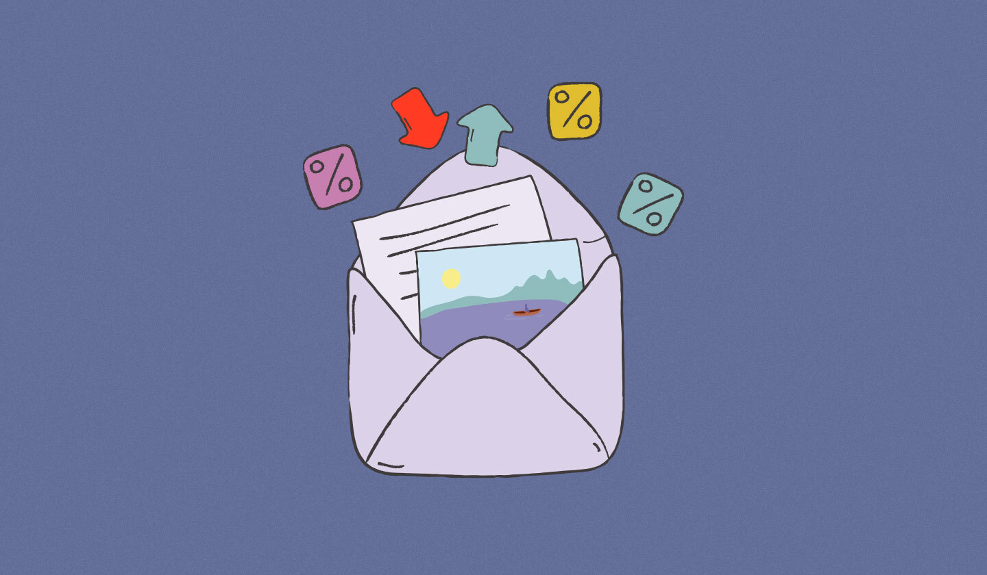
What comes to mind when you think of a really good email? Is there even such a thing? Is content king, or are you drawn in by carefully chosen colors and mind-bogglingly perfect image combinations?
When you’re marketing your business or your brand, there are a plethora of mundane tasks that eat up your day-to-day. From scheduling meetings, securing deals, to making sure your clients are being taken care of–– finding a way to unleash your creative spirit might seem impossible, and maybe even a little pointless. Content is what matters the most, right?
Well, yes and no. Your email content absolutely does matter. In fact, in certain sales scenarios a simple, plain-text email can perform better than one with images and tons of color.
However, because color increases comprehension by as much as 73%, and increases brand recognition by 80% there are instances where an HTML email outperforms plain-text. For customer interaction pertaining to e-commerce, newsletters, promotion, and onboarding–– something eye-catching might be just what you need.
As Cyrill Gross from Mayoris AG puts it, “In general, I see HTML emails as the better way, as they allow to present the content in a layout that the user already knows and can recognize. Especially for product-driven emails and services that involve emotions (such as travel, automotive, etc.). However, plain text email can provide added value for special occasions.”
Now is the time to channel your creativity into creating mesmerizing emails that solidify your brand’s image and get your audience to take action! Even if you’re not a trained designer, there are many tools available to help you painlessly turn your ideas into reality.
If you’re not already convinced to take the plunge and start making beautiful, breathtaking emails––or you just don't know where to start––these 10 impressive email designs will give you all the inspiration you need:
1. Avocode

Avocode is a design hand-off tool that prides itself on helping designers communicate and work together more effectively and efficiently in remote environments. This tool integrates with the tools and applications that the designers already use–– such as Slack, VSCode, Behance, and more.
This promotional email from Avocode is bold and eye-catching, even a bit mysterious. Despite the considerable amount of black, this email is streamlined. It does a great job of highlighting the reader’s problem without distraction. By using blocks of black and white to separate out the email’s copy, it’s quick and easy to read at a glance.
2. Headspace

Thinking about trying meditation, or having trouble sleeping at night? That’s Headspace’s specialty. This app helps its users to learn meditation to boost happiness and help them get a good night’s rest.
With that in mind, it’s no surprise that this brand’s color scheme is primarily bright oranges and yellows–– colors that the brain associates with energy, health, and creativity.
This welcome email is an excellent example of using branded color in customer interaction. Big bold pops of orange and yellow draw the eye, and the rounded design is highly pleasing to look at. Not only does this email reinforce the brand’s image, the way it separates information makes it really easy to skim through.
3. Film Supply

This company is your one-stop shop for high quality, curated footage. Essentially, Film Supply is a film-centric version of Shutterstock, in that it allows its users to search using specific terms and filters to find the exact footage they’re looking for.
In this slightly promotional onboarding email, they’ve done a great job at using design to make their program feel like a tangible product––even though it’s an online platform.
Even if you don’t read the email, you can understand from seeing the first image that their footage can be filtered to fit your exact needs. In addition, their use of color is careful and consistent, which can only further underscore the precision of their platform.
4. Asana

Asana, the online project management SaaS company, knows exactly when to use GIFs in their email.
This email is meant for customer retention–– so it’s important that it’s easy to read, not overly complicated, and shows the reader that Asana understands their pain points. In this case, perhaps the recipient stopped using the project management tool because it wasn’t efficient enough at the time.
Not only does this message empathize and address the reader’s frustrations, it utilizes the animation in a way that both solidifies and emphasizes the point of the email: Now, Asana is faster than ever!
__5. Great Jones

Great Jones is a kitchenware company specializing in quality pots and pans that put an emphasis on modern simplicity and good food.
In this announcement, Great Jones uses a GIF to take the focus off the email and direct it onto the product itself. New colors in stock? No problem. Because of their use of animation, you can easily view the product before clicking onto the page to purchase. This is a great tactic because it almost completely eliminates mystery. If someone clicks through, more likely than not, they’re going to buy!
6. Postable

Postable––a service that strives to make snail mail as simple and easy as email––is all about adding that personal touch.
Of course, that same consideration extends to their email lists. In their Halloween promotional email, they've used a viral GIF in a way that increases social relevance and overall engagement. On top of that, they even go so far as to integrate the pop of orange from the GIF into the main color block! If that doesn’t scream ‘Halloween’, I don’t know what does!
7. Glitch

This example is clearly going for 90s POP! Glitch is a web-app tech company, and community that aims to make app creation accessible to everyone.
Now, this email has quite a lot of ground to cover. This isn’t unusual by any means–– most onboarding communications tend to give out many tips and tricks to help their new users hit the ground running.
While this is generally great, a data dump has the opportunity to overwhelm the reader if the email isn’t meticulously well designed. The great thing about this is that there are many great ways to break it all up, and make it far more palatable. A few choices might be: infographics, sectioning, and color-blocking.
This onboarding email from Glitch uses color-blocking and sectioning highly effectively to break up what would otherwise be massive information overload! Additionally, its clever and distinct use of imagery keeps it lighthearted and fun–– and is unmistakably the on-brand for the company.
8. MindNode

MindNode is an app that helps you bring all of your ideas together without jumbling them up. If that’s the case, you’d think that their emails would have a similar flow.
Consider their onboarding emails. In this example, they’ve used an eye-pleasing, symbolic image to draw you in, and tie it together in a fluid, linear fashion. MindNode uses color in a way that enhances the reader’s experience and fortifies the information without distracting from it.
At the end of the email, they’ve used a contrasting color to really make the button stand out. Perfect for clicking!
9. MileIQ

MileIQ is an app that does exactly what you probably think it does: It tracks your mileage. It also helps you to differentiate business miles from your personal miles for tax purposes.
Admittedly, this might not sound exactly exciting, and perhaps you might expect rather dry communication from this type of business. Well, MileIQ has found a way to make using their app a more celebratory process. This email does an excellent job of using personalization in such a way to help the recipient to recognize the current value they have derived from using the app–– and it even goes so far as to show them what next steps they need to take in order to benefit further.
The confetti is also eye-catching, and immediately makes me happier to read through to the end. Saving money is always cause for celebration!
10. Vimeo

Don’t know Vimeo? It’s a video sharing platform targeted toward professional filmmakers and creators. Fun fact: It was the first video sharing platform to support HD video on the internet!
With that in mind, this company sets the bar high. Since their focus is on professional videography, their email design truly cannot fall short of the same expectations–– and they don’t! This email recaps the highs of Vimeo’s community throughout 2019 to an exceptional level.
Their use of vivid, contrasting colors make it easy to keep track of what you have already read, and the numbers are perfectly situated to help you stay on track throughout. All in all, this email is fun, it’s colorful, and it embodies the essence of the Vimeo community beautifully.
Wrapping it all up
With more and more people and companies shifting to remote work, emails will become a greater essential. Now that we’ve looked through all of these excellent sends, let’s take a look at what you should keep in mind when building your own extraordinary emails:
Consider the purpose of your email. Is this a newsletter? Are you trying to increase sales? The goal of your email should show in the email you design.
Ensure that the colors you choose are reflective of your brand.
Color-blocking and sectioning breaks up longer text into smaller and more digestible pieces.
Animation and GIFs help to drive home your message, and save your reader time.
Infographics are an excellent tool that allows your audience to easily skim your email, without missing any crucial information.
Responsivity is crucial to the success of your email. If your email is easy to read on the web, but difficult to read on mobile, you could be sidelining a significant percentage of your audience. The best way to ensure that your email adapts to any application is to use an email software that allows you to design specifically for this.
Personalization is a great way to build rapport, and to show your audience how they are individually contributing–– or what value they have gotten out of your product or service.
Now that these tips are top-of-mind, you’re well on your way to creating your own creative, jaw-dropping, lead-converting emails! Of course, these ideas aren’t to be taken as steadfast rules. There is no one-size-fits-all email design–– which is why so many great ones exist!
Take your time to experiment with finding the perfect balance between science and art for your brand. Elevate your email above being only technical and informative. Elevate it to one that is elegant and one that inspires your reader to take action–– whether that be clicking a button, buying a shirt, or updating their mileage.
But most importantly, have fun with it. It’s your business, your blog, your brand, your email. Whatever it is, show your readers how much you love what you do! And when you're all set to design your amazing emails, use Unlayer to make dreams into a reality.