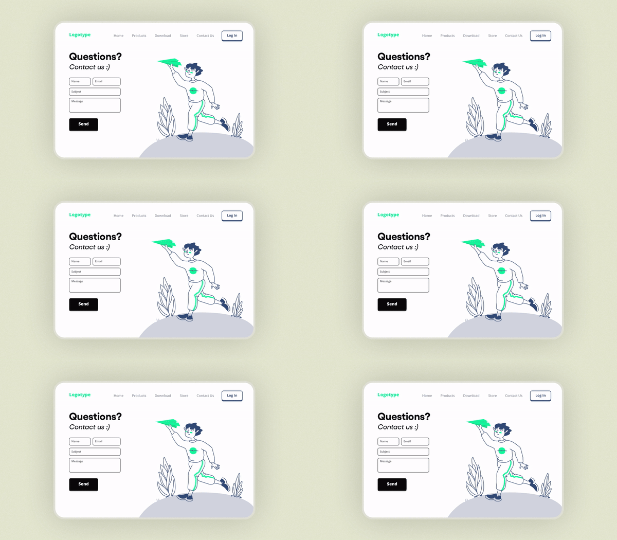
When it comes to inbound marketing, creating conversion paths throughout the buyer’s journey is the name of the game, and there are few better ways to do it than with landing pages.
If executed properly—that’s to say appropriately contextual, well-designed, engaging, and easy to understand and navigate—landing pages can be one of a marketer’s most powerful tools in moving their prospects through the funnel or flywheel.
Getting there, however, isn’t always an easy task. Building an effective landing page or landing page template takes a thorough understanding of your audience, your team and company’s goals, some level of design prowess, and the technical knowhow to build it all—but that doesn’t mean you have to hire a developer or top-notch graphic designer to bring your framework to fruition.
In fact, with the right resources, inspiration, and some basic knowledge, you can use a drag-and-drop editor to build attractive, effective landing pages in no time.
So, to give you a bit of all three, we reached out to a handful of marketers to get some of their favorite examples, picked their brains on where/how they find inspiration for themselves and their clients, and how you can use all of the above to build yourself effective landing pages in the process.
Charity Water - Classic and Thoughtful

Marketing Pro Advice and Analysis
What do you look for when choosing a landing page template as a model?
“I try to find other landing pages with a similar offering (product, service, nonprofit),” says Elizabeth Beechinor of Coefficient Marketing. “And I definitely look at what competitors are doing.”
What do you like about the landing page example you’ve chosen?
“It has all the best elements of marketing,” Beechinor continues. “It’s clear and concise, has a very human message that helps you relate, compelling visuals that reinforce why you should take action, and they've removed any obstacles or distractions so you can convert (or donate in this case) quickly.”
The Concept—and How to Build it Yourself
While there’s a fair amount of imagery and information for a traditional landing page, Charity Water does a fantastic job of segmenting both content and direction for each section they’ve created. Note that what appears to be multiple call to actions (CTAs)—an approach largely frowned upon—is really just a series of different pipelines to direct visitors to additional donation information and options, none of which detracts from the core objective of the page.
While the image above doesn’t show it as is, the entire first section appears above the fold when the landing page is initially loaded, following best practice with all of their most important elements: the form, the image, and the CTA.
In turn, because donations are such a direct ask and generally considered to be further down the funnel, Charity Water has also used the subsequent sections to build in additional context and a larger variety of donation options, including sponsoring a project directly, honoring someone special, long-term or repeating donations, and even alternate methods of payment beyond what’s available through their main form.
To build something similar on your own, the image itself is pretty self-explanatory—all you need are some basic elements like full-width images along with some icons, text blocks, CTAs, and a form to create something just a stone’s throw from traditional that’s also visually appealing and technically sound.
HubSpot - Thinking Outside the Box with Long-Form

Marketing Pro Advice and Analysis
What do you look for when choosing a landing page template as a model?
“Flexibility and experimentation,” says marketing consultant Chantelle Marcelle. “You need to be able to implement A/B tests, monitor performance on an ongoing basis to see what's working, and then quickly make edits with the goal of optimizing performance based on the results of your experiments and data collected.
“It should be simple and accessible for anyone,” she continues. “Even those who don't have extensive coding abilities should be able to adjust not only content assets like copy or graphics, but also the forms, header or footer content, CTAs, menu, etc. There are a lot of tools right now that do enable that, so I encourage people to do their research and take advantage of free trials to find what works best for them.”
What do you like about the landing page example you’ve chosen?
**“**It's fun and innovative,” says Marcelle. “It doesn't follow the usual standard that most brands follow now when it comes to landing pages.” “Sometimes you just need to publish something functional and straightforward, which is OK. But it's also OK to take time to build something beyond the usual to delight your website visitors and try to deliver a more compelling, memorable experience. That outside-the-box creativity differentiates brands from the rest of the pack. And that can often have long-term benefits in the form of more conversions, page visits, brand recognition, and more.”
The Concept—and How to Build it Yourself
To create their buyer persona landing page, HubSpot actually created a miniature funnel composed of several pages you can explore here—but don’t worry, you can build yourself a much simpler version that we’ll touch on below. But first, let’s put the whole idea into context.
By clicking the “Learn More” CTA visitors are taken to a simple, four-click walkthrough of why buyer personas are important before arriving at the page below:

By clicking the “Download Now” button, visitors are taken to a straightforward seven-field form as shown below.

If they clicked the “Build My Persona” button on the original landing page instead, they’re taken to a seven-step walkthrough that actually allows them to quickly build a basic buyer persona. On the final page, they’re given the option to save and share/export (shown below)—both of which bring them to the same form as above.

While this all might seem a bit complicated, consider the core concept of their entire approach.
First, every page is remarkably simple and structurally sound: just text, basic images, and simple shapes to frame them, all creating a step-by-step process to get to the form.
In turn, by going through this process—regardless of what CTA they choose—visitors are not only engaged and learn the value of what HubSpot is offering, but also likely develop a sense of commitment. After all, they spent the time either reading the information or creating a persona, both opportunities of which will be wasted if they don’t take the next step in filling out the form to get their desired outcome (save, download, or export).
Thankfully, you don’t need to be a coding whiz to get the same desired effects, especially since nearly every page is made of those basic components we mentioned above. In fact, you don’t even need multiple pages to achieve it. You just need to condense the concepts into one single landing page, which you can easily do with just about any drag-and-drop editor.
To reap the benefits of the “Learn More” mini-funnel for your more traditional lead capture focused landing page, consider this simple approach:
Create a two-column layout, much like the first HubSpot image.
On the left, a short, step-by-step overview of how/why your offer is not only helpful but indispensable to the visitor, composed of pairs of icons/images and text.
On the right, a form and a CTA.
To reap the benefits of the “Build My Persona” mini-funnel for your long-form sales landing page, consider this more complex approach:
Develop a single column, vertically oriented, multi-section landing page frame.
Based on your product, service, or offer, consider your audience’s pain points and what information is most helpful and valuable to your customers about what you do.
Segment this information with respect to informational hierarchy, then develop copy and images to convey it all step-by-step, section-by-section (and if you can generate engagement with simple interactive elements, all the better).
Cap it off with a form.
Of course, the latter approach is best reserved for those with complex, expensive, or high-commitment products/services, but if HubSpot is any example, even offering something as simple as a downloadable version of their guide or the persona a visitor created, it’s safe to say long-form landing pages are still alive and well!
U.S. School of Music - History Lesson

Marketing Pro Advice and Analysis
What do you look for when choosing a landing page template as a model?
“The biggest thing I look for in a landing page template is clarity,” says Doug R. Thomas of Magniventris.
“Does it pass a ‘3-second test’ -- i.e. can someone look at the page and immediately identify what's being sold and what the main purpose is? The key to this is three-fold: a strong headline, a strong image (or imagery), and a strong and prominent call to action. While copy has a large role in defining that strength, the layout should provide all three elements in that first view.
"In general, I love going back to non-digital examples for layout and design. One of the most "swiped" ads of all time comes from 1927, and it's always so interesting to see how closely the layout follows the Hero Image/Headline/Copy/CTA layout that is so common on websites.”
What do you like about the landing page example you’ve chosen?
“The image is evocative and sets the scene of the ad's story,” says Thomas. “I'd follow David Ogilvy's advice from the 80s to use a photo instead of an illustration - J. Peterman's ads from the 60s did this excellently.
The headline is clear, without being too obvious -- it tells the story without having to read the rest of the copy of the ad. It also ends with a well-typeset hyphen to make the reader anticipate another shoe dropping, leading them into the copy.
And then the CTA is set off from the text at the bottom-right, which was a common place for the CTA on an old ad, highlighting the rule to meet user expectations: the CTA should be where users expect to find it. The only addition I'd make to the CTA would be Claude Hopkins's suggestion from around the same era as this ad to put a box around the CTA to make it even more obvious.
In the current times, there are a few tweaks you might make to the layout. But overall, the layout is timeless and quickly can be applied to digital landing pages.”
The Concept—and How to Build it Yourself
Despite how full the entire layout is, the concept is relatively simple: use basic elements like the image, title, and CTA to tell the main story in three seconds.
In this case, you could nearly rebuild this verbatim with some pretty simple parts—a single, horizontal column at the top for a full-width image and header, multiple columns underneath to hold any icons, copy, or subheaders, then cap it all off with a form and CTA wherever you can fit it above the fold (that is, if you’re trying to stick to modern convention).
Conclusion
With that all said, however, there’s still plenty of room for experimentation as long as careful consideration is given and you have the right reasons for attempting it. In the end, the main purpose of your landing page is to delight, inform, and invite your audience to participate in a meaningful exchange—regardless of whether you’re just collecting information or making a direct sale.
So, while we’re happy to provide inspiration and direction, don’t be afraid to get creative. After all, if others weren’t, we wouldn’t have such good landing page examples in the first place.


